Heylen Thienes is not known for doing things halfway. No, she prefers to dive in, go deep, and not stop until the best solution is found. It’s this skill and tenacity that have driven her career and led her to found Tricorn Black, where she can create immersive design experiences for her clients.

Photos by: Project Photos Zee Wendell
With her formative years spent admiring the intricate architectural details and artistry of the buildings in South America and Europe, Heylen brings a historical depth of knowledge and appreciation that informs each one of her designs. Pulling from her own storied life experiences, she knows that people are more than just their current states, with past lives, nostalgic references, and layered experiences that blend together to make them unique. This story-driven philosophy is applied to every detail of her designs, from material and color selections to textural palettes, culminating in spaces that reflect her clients and engage people’s senses.
Involved at every stage of the design process, she immerses herself in the concept to develop it in a way that stays true to the vision, yet leaves space for inspiration and curiosity.
About Heylen
What inspires your design aesthetic, and how has it evolved over time?
"My design aesthetic is constantly evolving because we are constantly working with different client and every project is client led. But I find that when I walk into a space and hear people’s stories, the spaces start speaking and defining what they want, what they need. I am also always looking for new materials, new ways to bring color together, and I’m ever curious about sub cultures, what people are doing in different places and communities. I recently came across an article about Mexican Cholombianos and went down a rabbit hole, reading about the hairstyles, the music, how it all started. This curiosity is constantly informing my design aesthetic and point of view."
What role do materials like tile play in shaping the character of your spaces?
"Once I have an idea for a project I set out to find just the right material for it, by this time I have a really good idea of what the space needs, how it should look and feel and the story we’re trying to tell. Our tile selections often become strong support characters, where the main character could be cool and chill on their own, but the tile takes it to another level. It’s very layered and intentional."
Do you have a favorite project where Haustile played a key role? What made it special?
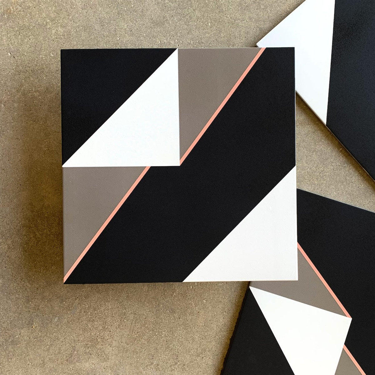
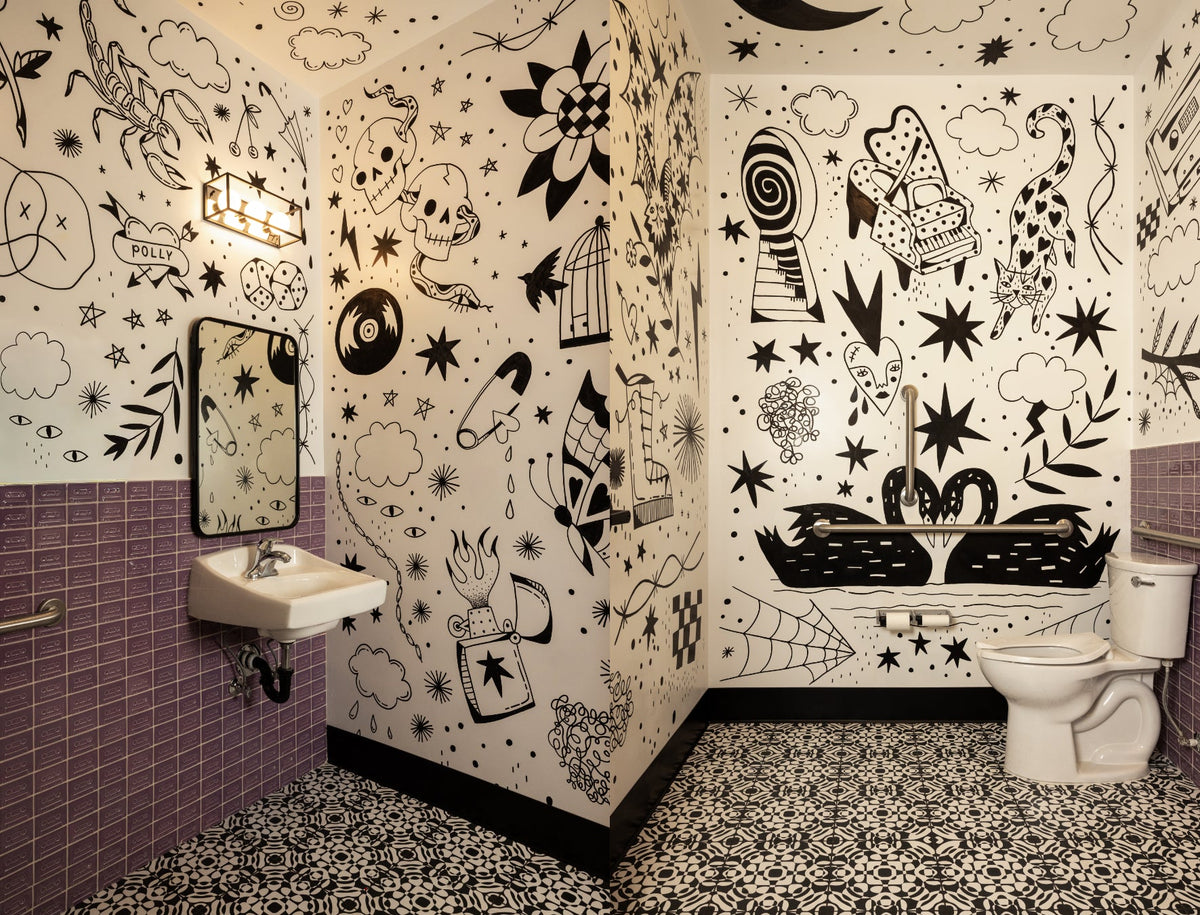
"The bathrooms at our Bend School of Rock project . The bathrooms had a main character and two solid supporting characters. Both the wall tile (by Portland based studio Clayhaus) and the floor tile by Haustile, brought depth that met the whimsical weight of the artwork by Mac Pike. The three components created a delicate tension, playing incredibly well together. If this were a movie, they would all win Oscars."

Photos by: Project Photos Zee Wendell
About School Of Rock
Tell us about the project — what was the overall vision and purpose for the space?
"The goal was to strike a balance between designing a tantalizing, memorable space and adhering to the required brand standards. We incorporated a mix of dynamic elements to create an environment that is vibrant, engaging, and inspiring, while reflecting the brand and ownership’s energy and purpose. We took inspiration from well-known artists, cultural moments, and songs to design a space full of color. It was important that the design did not take itself too seriously."
"We wanted it to feel like a place where students would immediately feel at home and, over time, make it their own."
"The inspiration was ‘the bathroom in your favorite live music, basement bar’. Memories of dingy bathrooms with colorful notes and quotes on the wall, the odd sticker and the patinated, broken tile that had probably not been touched in a few decades (I grew up in London so this is what I referenced.) When it came time to synthesize this concept, we commissioned the client’s favorite tattoo artist to ‘graffiti’ the bathroom walls with artwork inspired by The Cure’s ‘Boys Don’t Cry’ and the PNW’s own Nirvana. Mac’s style was the perfect blend of grit and whimsical."
"We then paired it with a cassette tile on the walls and knew the floors needed to match that same energy, so when we came across Haustile’s Gossip design, we knew it was a perfect choice."
What was the reaction to the finished space? (yours, clients, press, customers if applicable, etc.)
"The response was overwhelmingly exciting, from both clients and patrons alike. Every adult that has seen the bathroom has felt the twinge of nosta- lgia pulling at their heart strings and every kid that has walked in has asked many questions. Good ones. They know the bathrooms are really special.
Our hope, ours at Tricorn Black and the Clients for this project, was to inspire kids to be creative, to experiment, squiggle outside the lines, get comfortable with the parts of yourself you’re trying to figure out and above all take risks… every artist and tile company used in these bathrooms represented that. At one point in their trajectory, these artists and companies decided to do something differently and these bathrooms represent that."